
Storecheck London 2023 – tracking new trends

Flashy colors
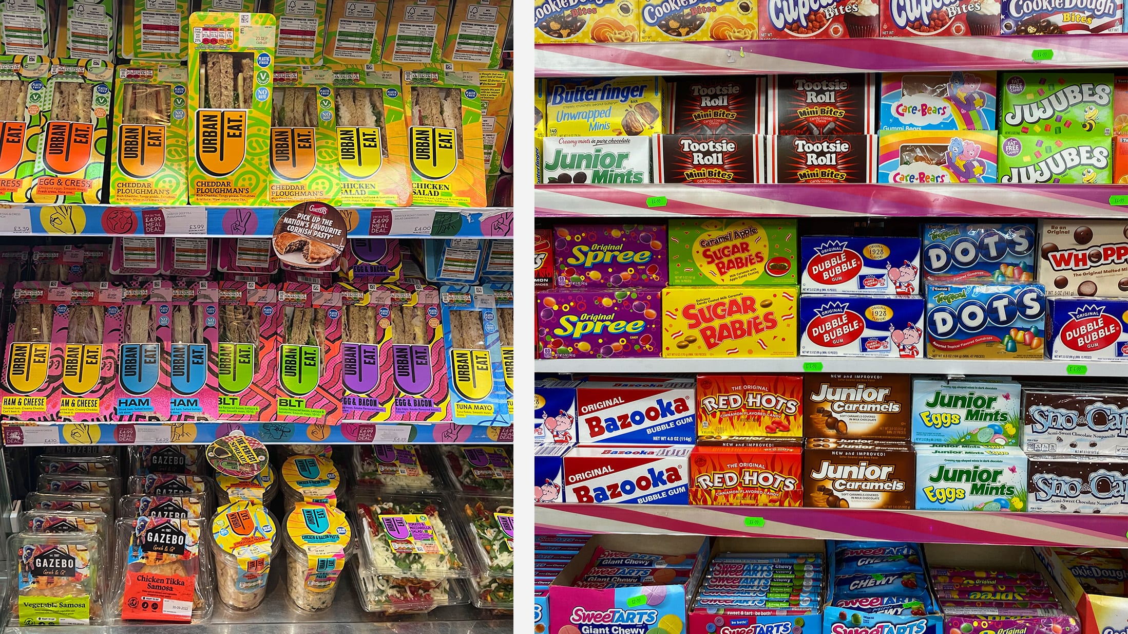
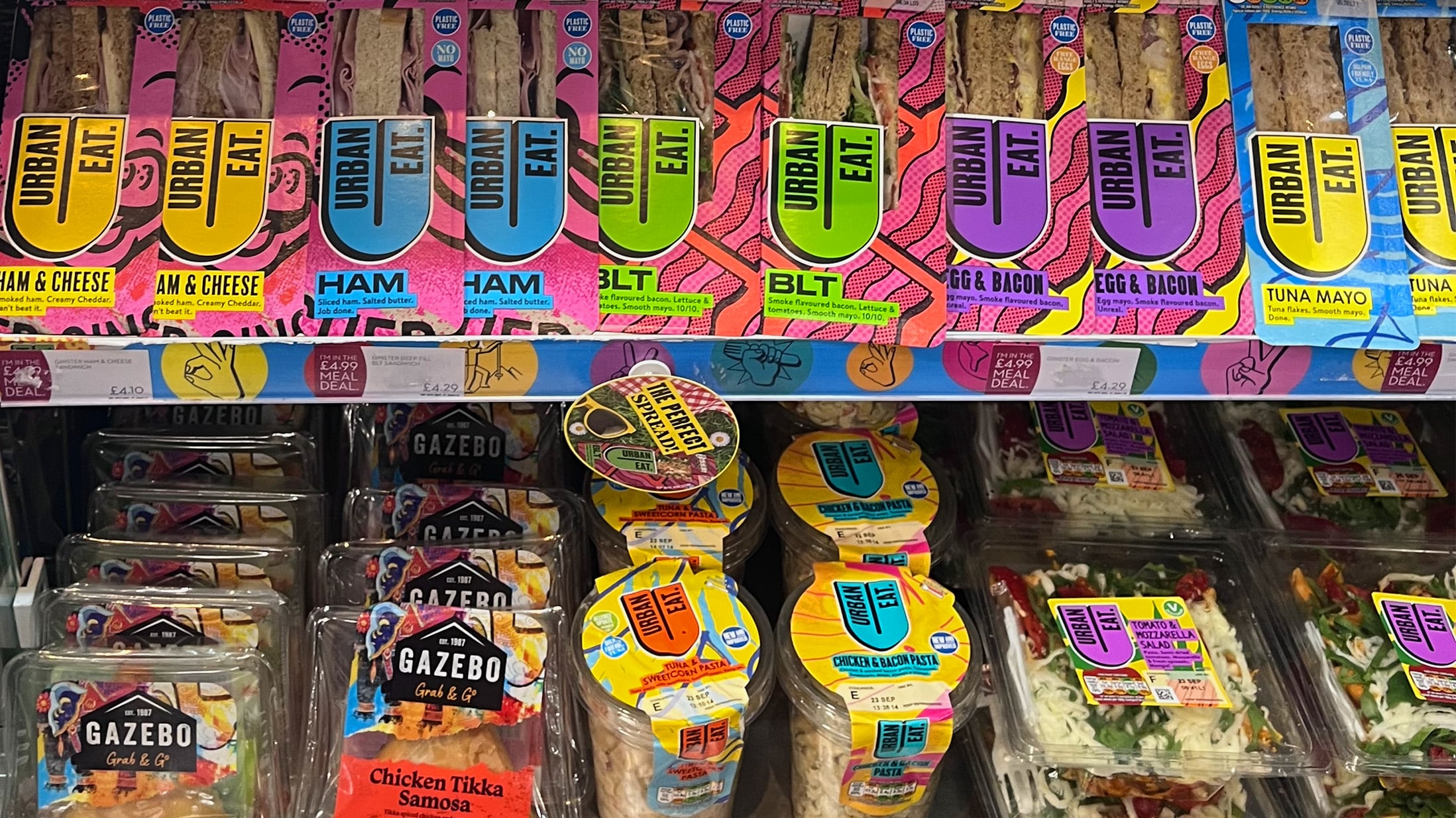
True to the motto “Life is all about joy and color, not trouble and gray,” many packages are presented in cheerful, bright and eye-catching colors. Good examples of this are the products from Urban Eat.
Vegan meat alternatives
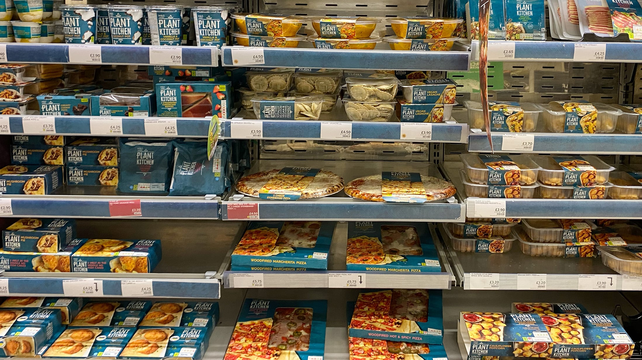
Vegan meat alternatives such as those from Richmond and Plant Kitchen are becoming increasingly popular and are thus also taking up more and more space in supermarkets. Such purely plant-based products with a meat look are still “just” a trend, but we are pretty sure that this type of product will establish itself permanently in the food market.
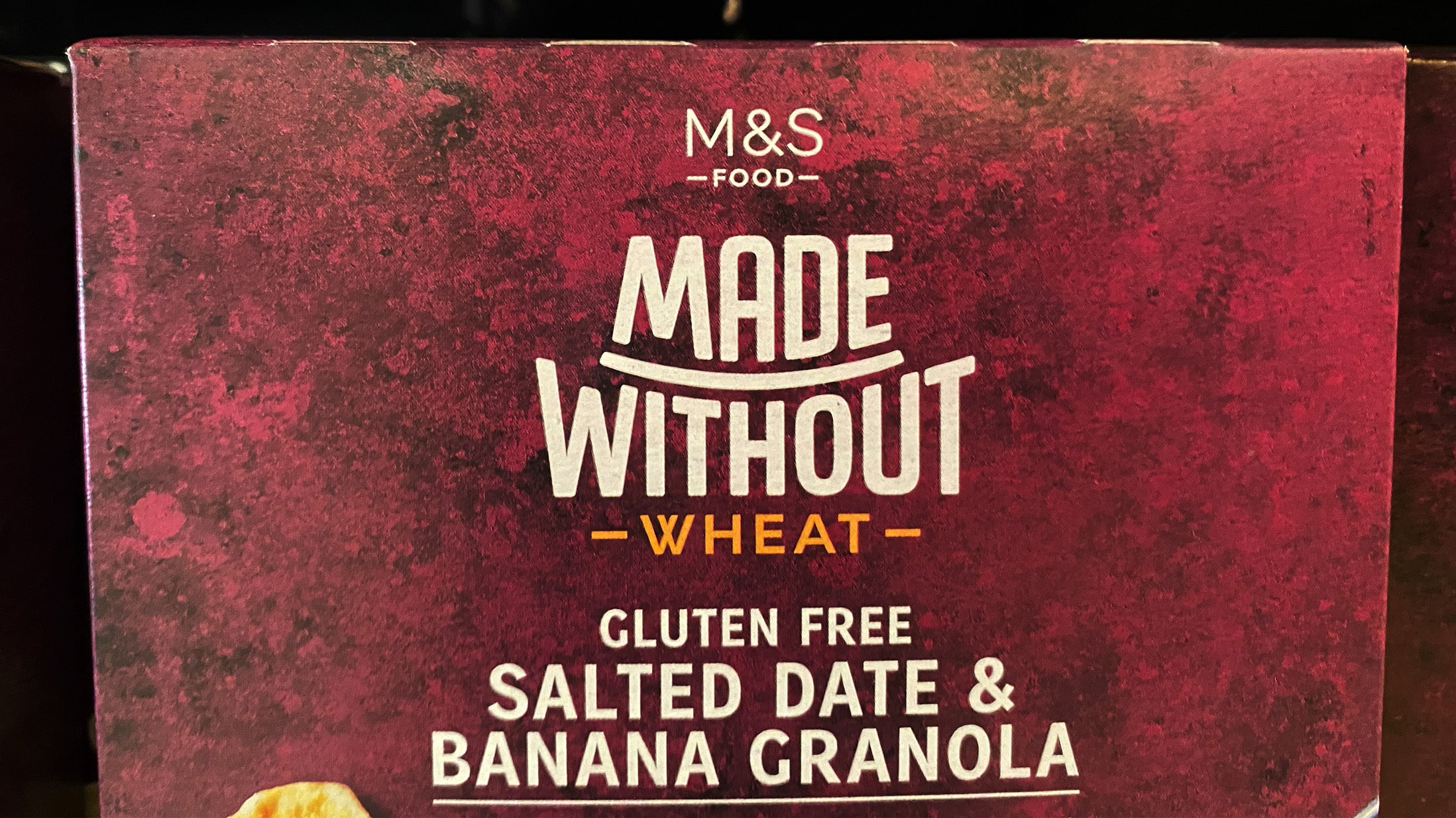
Increased health awareness
In line with the vegan meat alternatives, we also repeatedly encountered the trend of increased health awareness during our extensive store check in London. Products without certain potentially allergenic or otherwise harmful ingredients are ‘in’. So it’s no wonder that some manufacturers are taking advantage of this and introducing meaningful brand names such as “Made Without”.
Traditional patterns reinterpreted
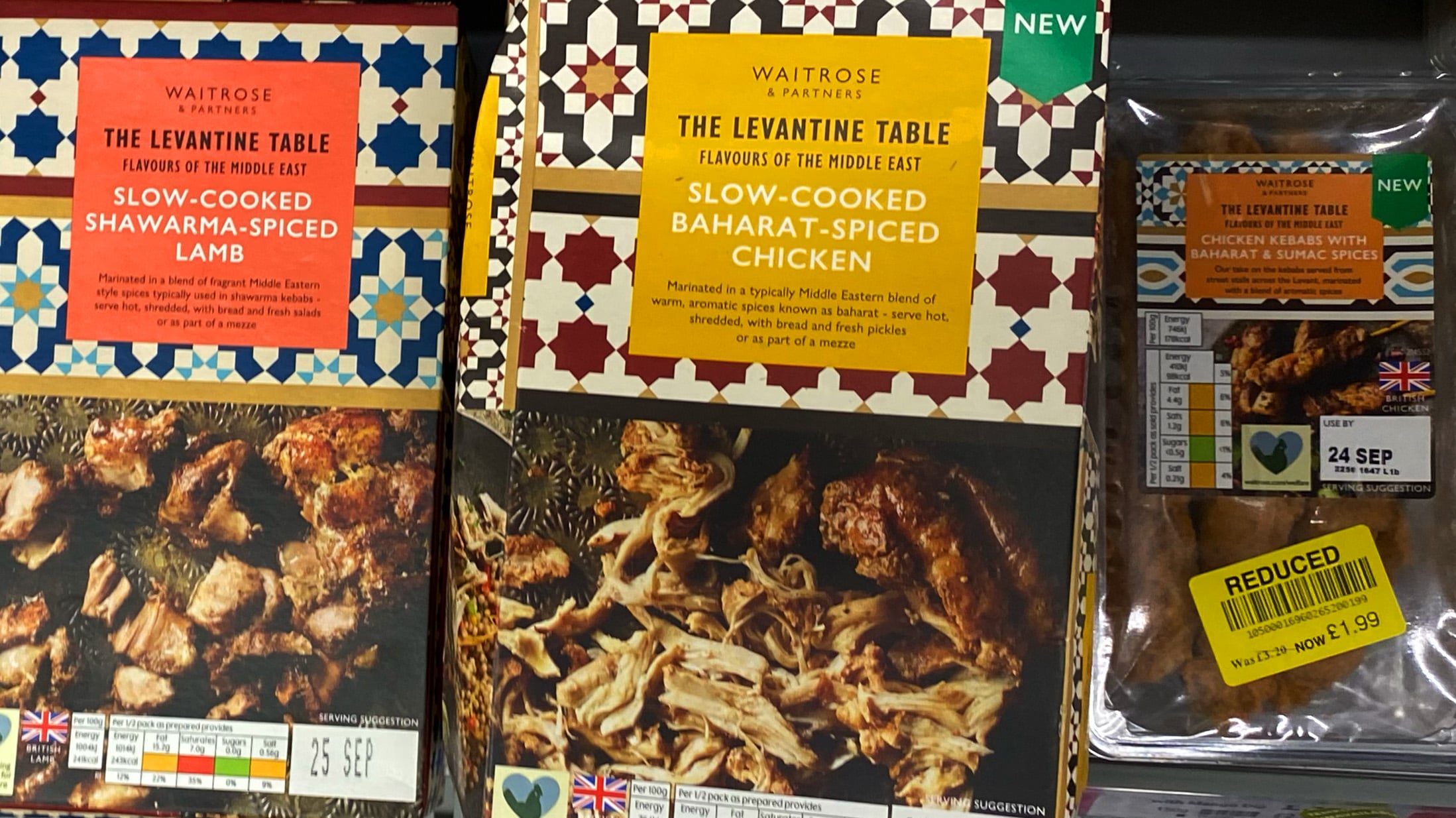
Despite the focus on continuously modernizing products and their packaging, some brands continue to reflect on their origins and incorporate them into the design of their packaging, for example through new interpretations of traditional patterns or the adoption of traditional elements. Examples of this are the product packaging from Waitrose’s Levantine table range and the packaging for Fruitajik products, for whose design we are responsible.
Paper patterns and riso prints
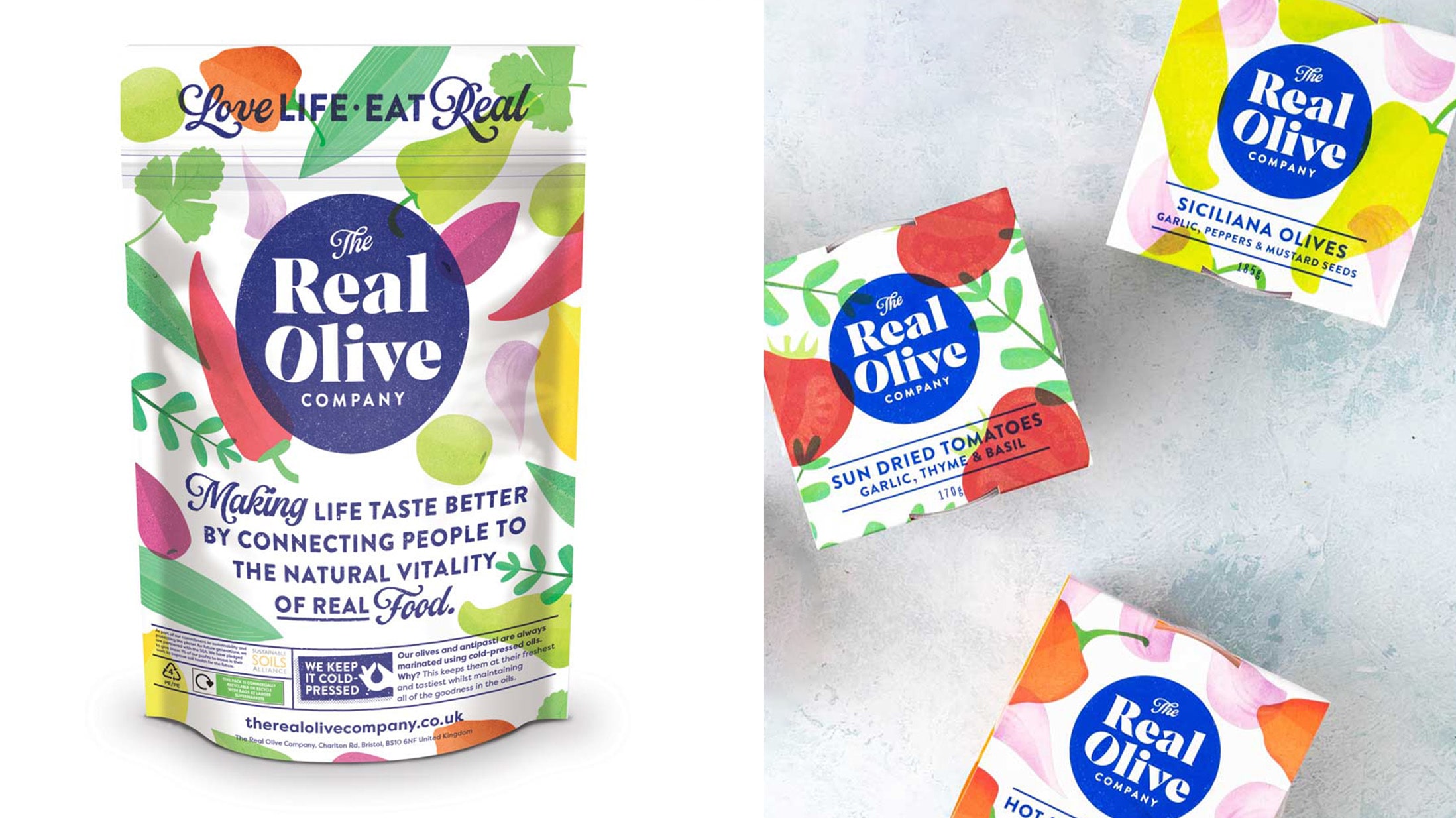
Paper patterns and riso prints, such as those shown in the packagings from The Real Olive Company, are also popular. This design trend is closely linked to the sustainability trend – after all, paper patterns in particular have a particularly natural and environmentally friendly effect.
Play with typography
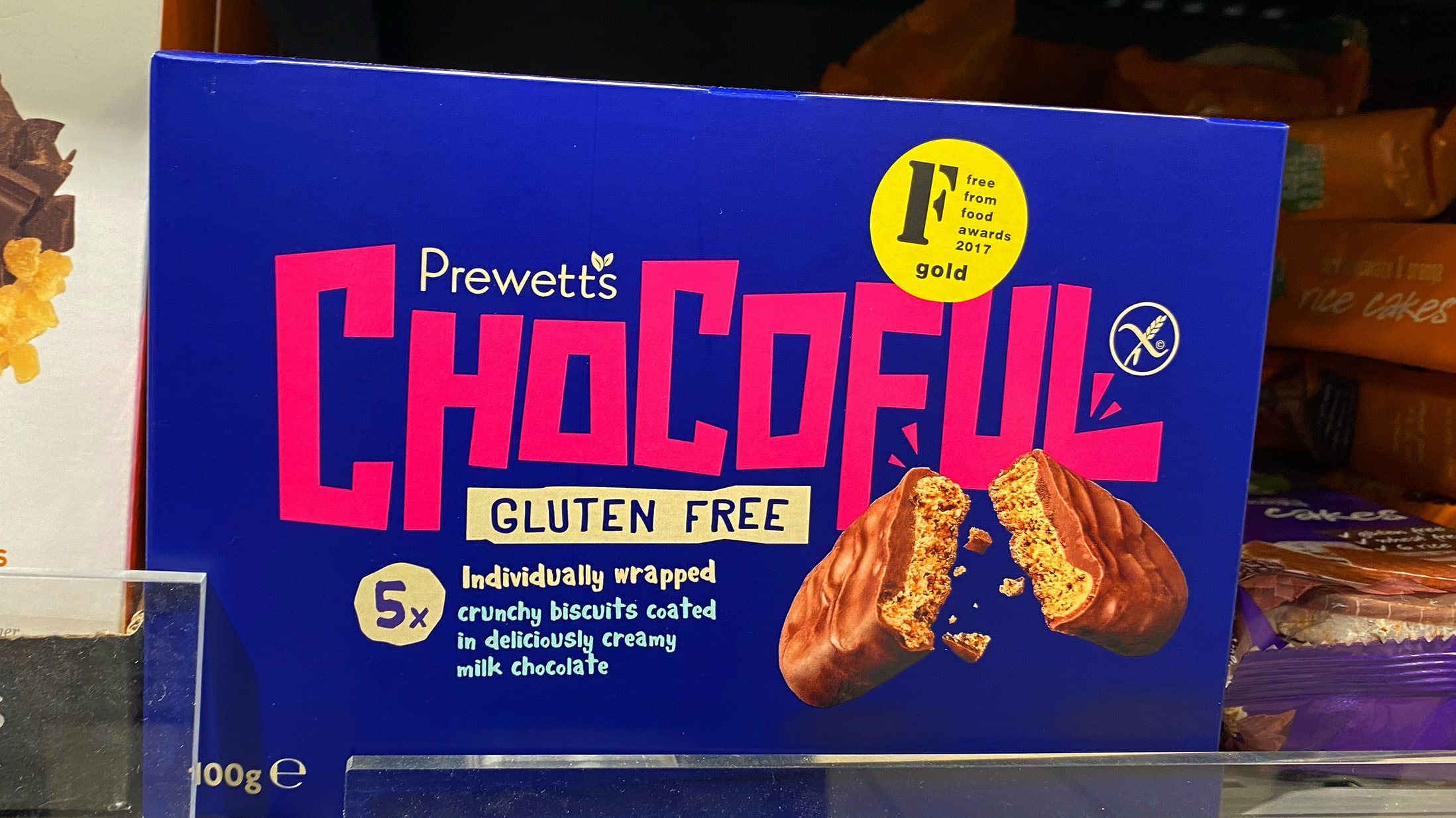
It is also noticeable that brands and packaging designers now attach even greater importance to typography and dare to experiment a little more in this respect. From handwritten variants, as with the Pasta Range from M&S, to striking character typographies of the (sub)brand name, as with Chocoful, there is a wide variety of designs. So in terms of typeface design, a certain playfulness is currently perceptible.
Fire in the foreground
To return to the distinctive character typographies of the brand name: A clear trend in packaging design is also increased brand centricity. This means that the brand is in the foreground. The space that might previously have been taken up by a large food shot is now increasingly occupied by the brand name. In Germany, for example, the new packaging from Bahlsen reflects this development.
Bye, Foodshots!
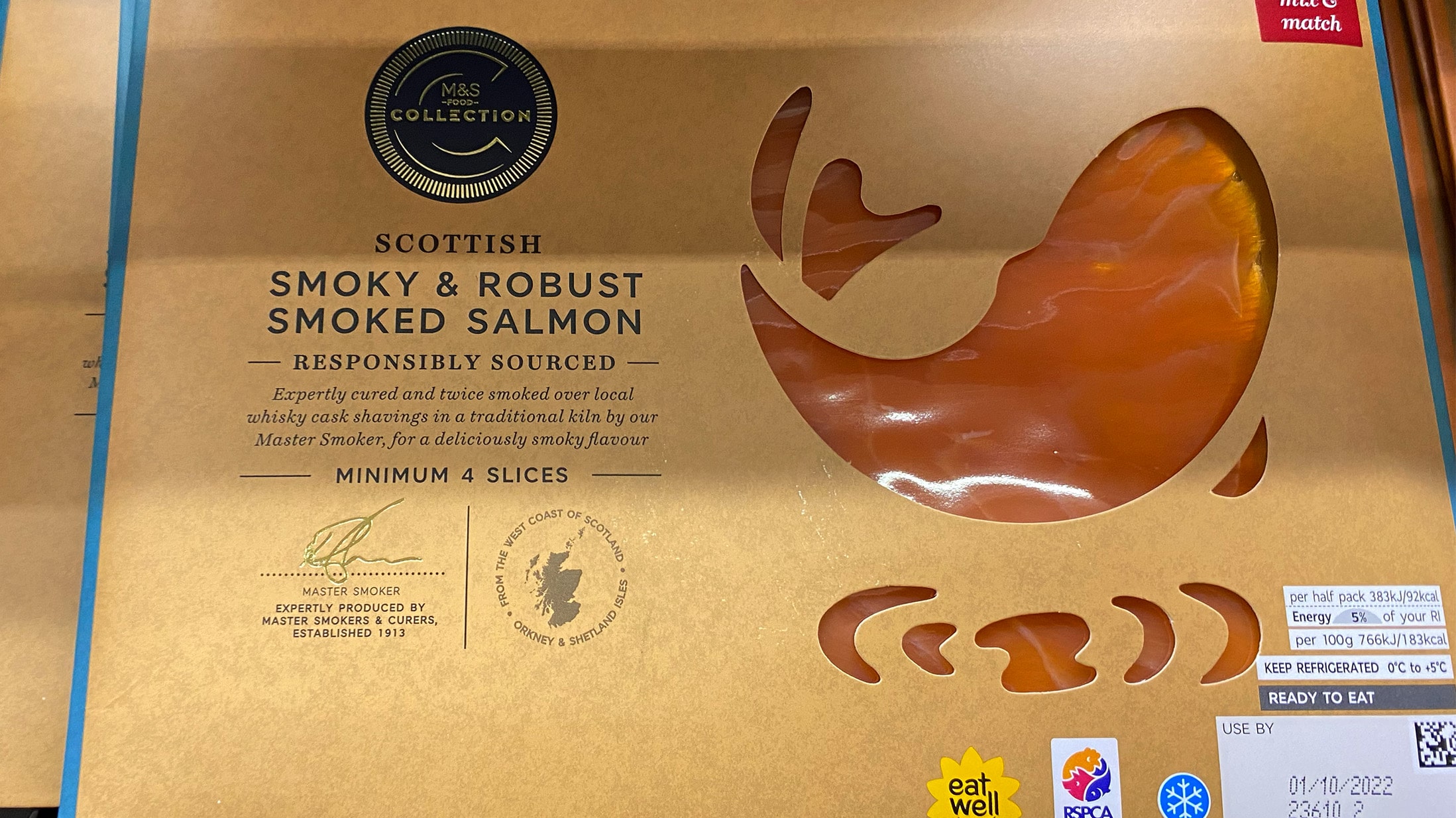
In general, the food shot is often no longer the measure of all things on the packaging of food products. Some manufacturers now even do without it completely and instead reveal the texture of the respective food by making the majority of the packaging transparent. Transparency is a point that is becoming increasingly important to customers anyway. The unveiled presentation of the contents takes this into account and ensures that the product speaks for itself. During our store check in London, we noticed this trend in particular with some of M&S’s products.
Heritage elements
On the subject of transparency, it should be added that heritage elements are also being integrated more strongly into the packaging design in order to convey to consumers, without further ado, where the food comes from.
Direct communication with the customer
The goal of every brand is to appeal to consumers with its own products. So it’s only natural to put this into practice literally, as Smartwater does in a creative way:
– “Have we met before?”
– “Hi there, me again.”
– “I’m 100% recycled.”
Statements such as these are prominently displayed on the brand’s water bottles, so that the products in a sense enter into direct communication with the viewing customer and at any rate amuse and to some extent also inform him. Although relatively unspectacular in design, the somewhat different look with the inscriptions immediately catches the eye. Just do the test yourself: which shelf with mineral water bottles attracts your attention more?

Minimalist approach with accents
Brands and packaging designers are increasingly choosing a minimalist approach, but without letting boredom set in. The packaging is reduced, but still unusual – especially through the use of playful fonts and vibrant colors, as described above. This makes the products appear modest in a positive, down-to-earth sense and at the same time exudes joie de vivre – a combination that undoubtedly corresponds to the zeitgeist and the attitude of the modern consumer.
We encountered all these trends again and again during our Storecheck in London 2023. It is very likely that they will increasingly spread to supermarkets in the DACH region in 2023/2024.