
The Bolognese from 3Foodies is something very special: the result of the passion and talent of three German chefs and entrepreneurs who not only understand each other magnificently in culinary and business terms. This sugo, whose proud price of 5.80 euros already wonderfully sums up the premium quality, contains only fresh, natural ingredients, delights in addition with delicious roasted aromas and tastes as good as from la mamma, la nonna or your favorite Italian. 3Foodies wanted to renew the look of their extraordinary Bolognese – and we were on the spot.
The new design had to fulfill two aspects in particular: First, it was important to clearly communicate the brand’s unique selling points – 3Foodies stands for first-class premium quality and the traditional Italian’s passion for cooking and enjoyment. On the other hand, it was a major concern to clearly distinguish 3Foodies’ Bolognese (also) visually from the Sugos of the competition on supermarket shelves, to give them a real perceptual advantage.
And then another point played an essential role: in order not only to make consumers look and compare, but also to make it easier for them to choose, the packaging design was also about making the four fantastic varieties of Bolognese quickly and easily distinguishable.

We have solved these three tasks as follows:
1. quality and passion
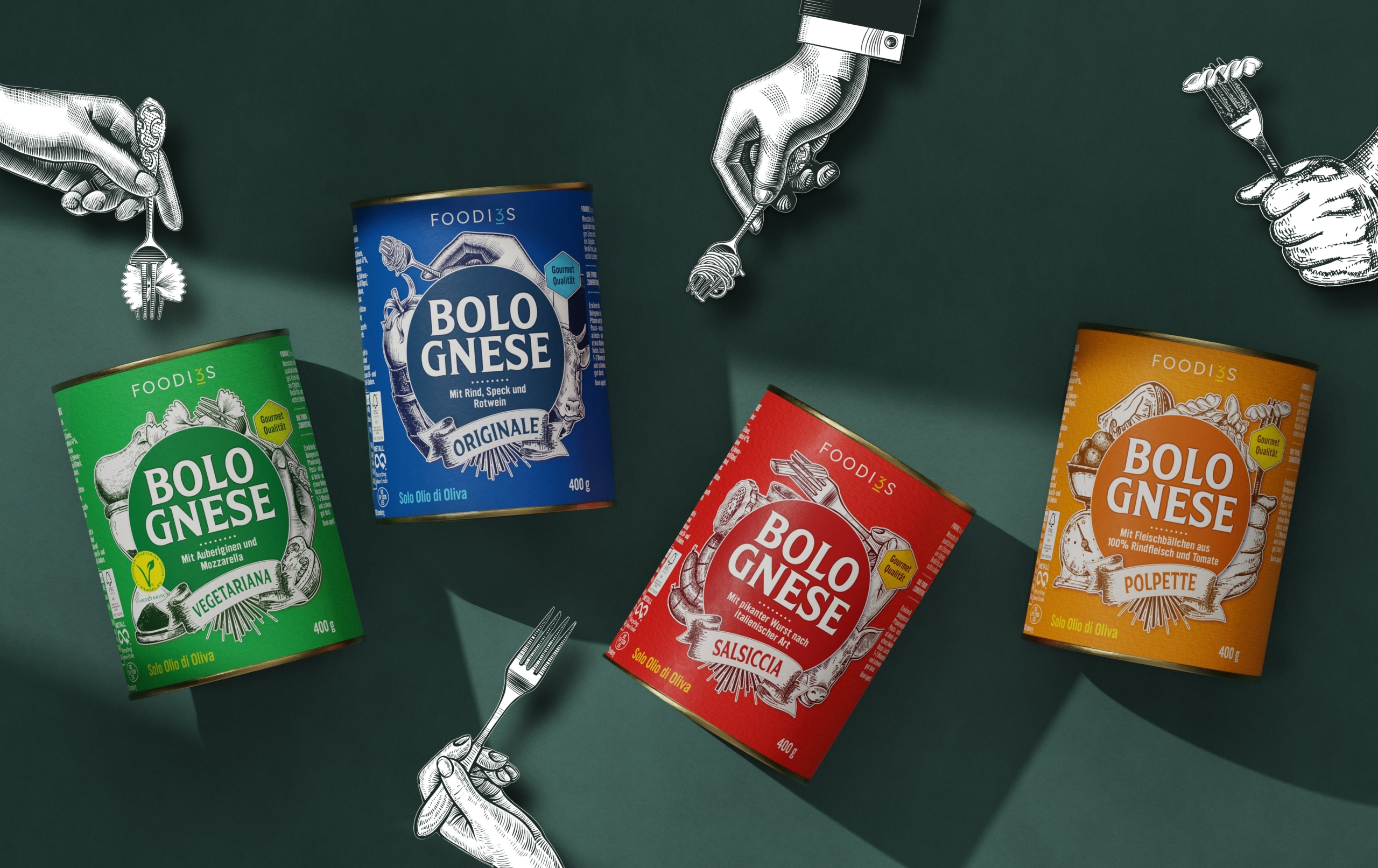
The wood or steel cut gives the label both a high-quality and traditional look. It kills two birds with one stone and reflects the special features of the brand in the best possible way. The passionate desire for cooking and enjoyment is embodied in the interflowing illustrations around the central Bolognese circle. The illustrations are always precisely matched to what the respective variety contains and therefore characterizes.
2 Clear differentiation from competitors
When we looked at the competitors of the 3Foodies brand, we noticed many similarities: Almost all brands rely on classic designs for their pasta sauces, without appearing particularly innovative or creative. The ingredients and possibly a serving suggestion are simply depicted. The dominant packaging is the glass container, sometimes more elongated and narrower, sometimes lower and wider. It is also apparent that the different varieties are not very strikingly differentiated.
Our goal was to design the packaging of the 3Foodies Bolognese in such a way that it stands out from this “standardized mass” at first glance and thus, to a certain extent, occupies a special position on the shelf, in order to appear premium-like for this reason alone. In terms of design, the products should present a successful mix of international best-practice sugos – that is, stand out typographically, represent the manufactured look, be striking and also come across as individual.
– playful use of (typo)graphic elements
– copperplate illustrations with a handcrafted character
– round label
– strong use of color
– integration of the ‘3’ of 3Foodies into the logo (“FOODI3S”)
It is primarily the listed design elements with which we have upgraded the packaging design of 3Foodies’ Bolognese to a best-practice sugo in the German market. In order not to lose the equally important structure despite the playful tendency, the inside of the circle, which defines the product type and the respective variety, is deliberately reduced and tidily designed.
Incidentally, the tin can acts as another feature that sets 3Foodies apart from most other brands.
3. easy differentiation of the four varieties
The bold use of color contributes to the desired posterity – and at the same time ensures that the four varieties of 3Foodies are very easy to distinguish. Red for Salsiccia, blue for Originale, yellow for Polpette and green for Vegetariano: each variety shines in the base color that best suits it.
With all these design elements, we have fully accomplished the mission of making 3Foodies’ Bolognese look as unique as it is composed and made. The new look presents itself definitely premium, but without being stiff, and wonderfully traditional without being oldschool – assolutamente perfetto!


