HiPP is one of the most popular German brands for baby accessories. With its products, the brand wants to make parenthood easier for mothers and fathers and help the little ones grow up healthy and lively.
Such high demands must first be met in full – a challenge that also has its pitfalls. At HiPP, it was the packaging of the boxes – for example, for the organic combiotics and organic children’s milk products – that ran counter to the desire for simplicity. We took care of the necessary changes.
There were a number of small problems with the original packaging design that added up to a whole that was not very customer-friendly. We will now summarize what these problems were and how we solved them.
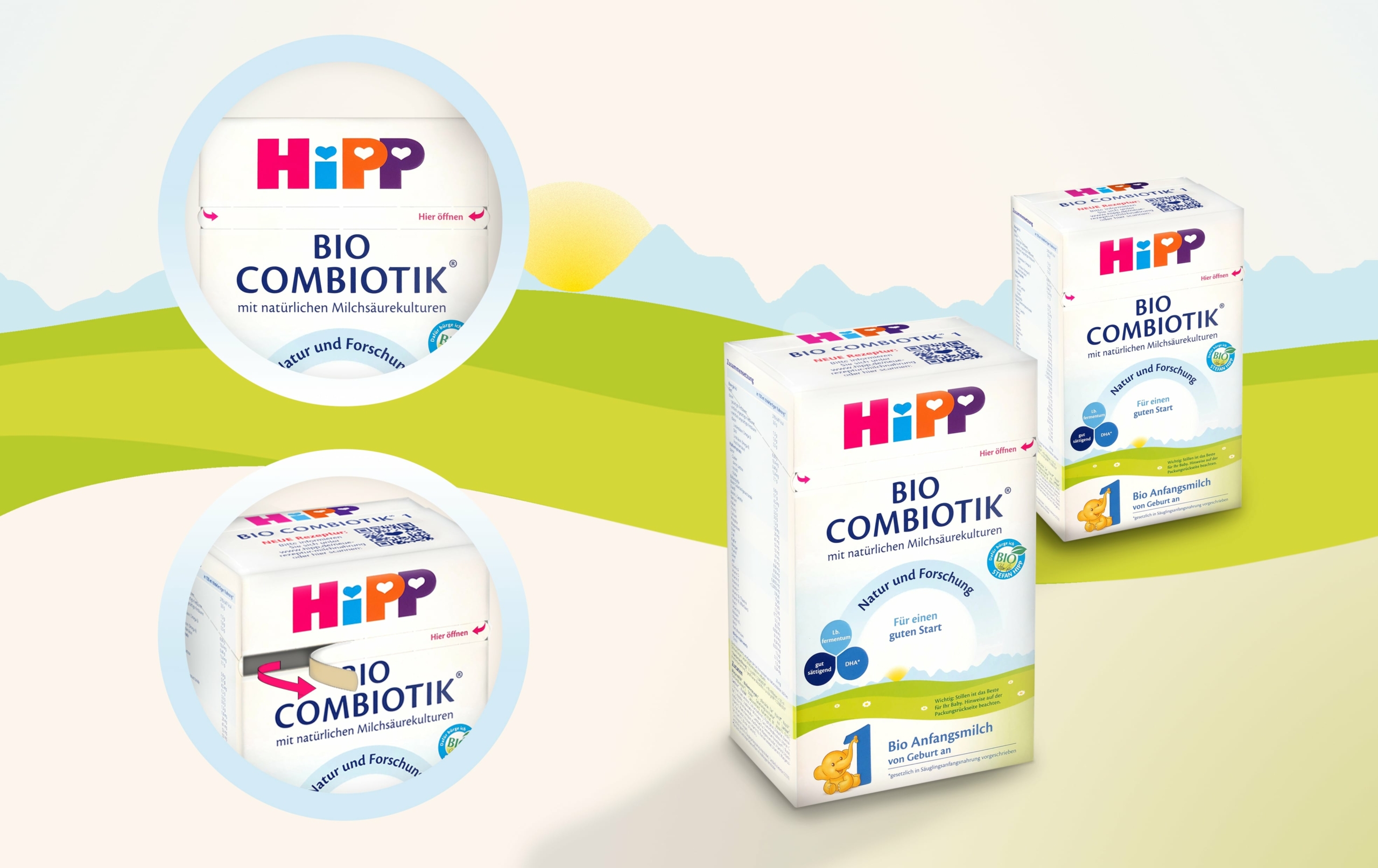
1. unclear opening mechanism
You look at the package, turn it over and over, try it out for minutes, and end up with a half-destroyed cardboard box in front of you: hardly anything is as annoying for a consumer as such a scenario.
The HiPP packaging was not quite as dramatic, but the opening mechanism was not self-explanatory – which is exactly what it should be.
In order to open the HiPP cartons, the consumer first had to read a three-step instruction on the lid – something that only costs time unnecessarily.
Nowadays, there are many ways to make the opening mechanism absolutely self-explanatory – by means of tear strips or lid shaping including a removable adhesive label or reclosure hook. Each of these variants ensures a defined initial opening, and the lid-shaping versions – if carefully processed – even ensure practical reclosure. We offered HiPP these three solutions – the choice fell on the tear strip.
2. lost branding space
The unclear opening mechanism had another disadvantage: due to the necessary instructions for opening on the lid, a prominent branding area was wasted.
By redesigning the opening mechanism in a self-explanatory way, the instructions on the lid became superfluous and the wasted branding space was thus freed up again. It now presents only the essentials: the brand logo and product name.
3. severed contents and unsettled lid area
An additional weakness of the packaging design had to do with the expanded lid space: Some content occupied the space that the perforation of the original opening mechanism also traversed, which “separated” some information. This, in turn, made for a very unsettled look of the lid overall.
To counteract this restlessness, we moved all informative content below the lid surface. As a result, the latter has been completely cleaned up, or is now only provided with ornamental HiPP visuals.
4 Unused free space in the nutrient composition table
Logically, we had to make further changes so that it would be possible to accommodate all the information under the cover. We saw the opportunity to do this in the nutrient composition table, which was extremely generous and yet very confusingly designed. It contained far too much unused free space.
We solved the problem with the principle “more columns next to each other and fewer rows below each other”. As a result, the table is now much more compact and still easier to grasp – and the space saved is filled by the previously separated contents of the cover area.
5. unstable alignment of elements and contents
In several places, the packaging of HiPP products showed an uneven alignment of elements and content. This in turn led to the design appearing less structured, almost chaotic.
To give the packaging design more structure, we repositioned individual elements and arranged them harmoniously next to and among each other in order to direct the viewer’s gaze much more stringently in one direction and not to confuse it.
6. Difficulty in reading due to wide single columns
It has been proven by the psychology of perception – and everyone can confirm this from their own experience – that it is unpleasant to read wide lines. This was also a flaw on HiPP’s packaging that needed to be improved.
We transformed the wide single-column design into two columns with very compact lines that are quick to grasp and easy to read.
7. if the tree is in the way and makes mom wonder….
… then something is wrong with the design. On the previous packaging for organic infant milk from the twelfth month, the slide led straight to the tree, so that the elephant threatened to crash into the trunk when sliding down. Not a pretty picture.
We mirrored the slide along with the elephant to the other side. This resulted in a reasonable distance from the slide to the tree. This protects the elephant and spares the consumer useless musings – and the brand a negative association.
After the extensive adjustments, HiPP packaging now appears as it should again: simply customer-friendly.


