Looking at the food industry, one thing is clear: The trend is clearly moving in the direction of naturalness and freshness. This development is forcing every brand to rethink and redesign. Even established brands like Maggi are no exception. In order to remain competitive and possibly attract new customers for its products, Maggi had to adapt its bouillons both internally and externally, to make them greener, so to speak. The brand gave Berndt+Partner Creality the challenging task of creating a more natural packaging design that would harmonize with Maggi’s corporate identity. Our designers were happy to accept it and mastered it brilliantly.
In view of the literally natural market development, Maggi’s various bouillons were perceived by more and more consumers as rather artificial. At the same time, the competition was changing its tune and attracting large sections of the customer base to its side. Maggi could no longer stand idly by. It was time to finally integrate more naturalness into the products and on their packaging. Maggi once again turned to us for the creative implementation of an effective packaging design.
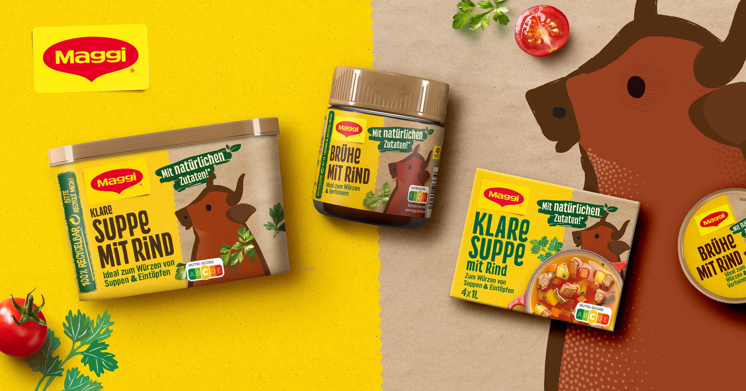
We were asked to make the appearance of the bouillon packs significantly greener, without thereby throwing the very unique charm of the traditional brand overboard. In addition, it was important to the client to make the products as visually appealing as possible to shoppers in the supermarket – not an easy task, considering that the bouillon packs provide only a very small area for the design and are usually placed far down on the shelf.
So how did our designers at B+P Creality meet the challenges? What design measures led to the goal? There were essentially two major means that brought the desired success:
1. expressive typography
The modern, effortlessly legible type size and, in particular, the bold typography with clear hierarchies and a sensible layout ensure that consumers immediately recognize that natural ingredients await them in Maggi bouillons and that the packaging is 100 percent recyclable. Furthermore, the consumer sees at first glance the information about the type of bouillon in question. This is because this elementary text module is the largest on any packaging.
2. pictures of appetizing fresh ingredients
The relatively large food shot, which takes up about half of the front and combines illustrations with appetizing images of real fresh ingredients, also contributes a considerable part to the more natural appearance of Maggi Bouillons. And this greener impression logically makes the products more inviting to consumers.


