Maggi Magic Asia is a cult and undisputed market leader in the field of fast Asian cuisine for the home. To make sure it stays that way, we’ve been commissioned by the popular German brand to refresh its packaging design, which is now more striking, more precise, clearer and all-around more modern. We start with the introduction of the classic Noodle Cups.
The tasty Maggi Magic Asia product line has been on supermarket shelves since 1992 – and in the cooking pots of enthusiastic gourmets who value eating well without having to spend a lot of time at the stove. The Noodle Cups do both. They bring with them the special taste of Asian cuisine and can be prepared in just a few minutes.
The redesign of the packaging focused on two points:
– Maggi Magic Asia Noodle Cups had to remain 100 percent recognizable to consumers. We were not allowed to change the content of the sub-brand and had to retain core features such as the dark background.
– Our main task was to bring the design into the present, so to speak, to create a contemporary visual reincarnation. What essentially characterizes modern product packaging are emotionalizing images and/or symbols, a clear structure and the clear presentation of all relevant information.

Based on these conditions, we made several small but subtle adjustments:
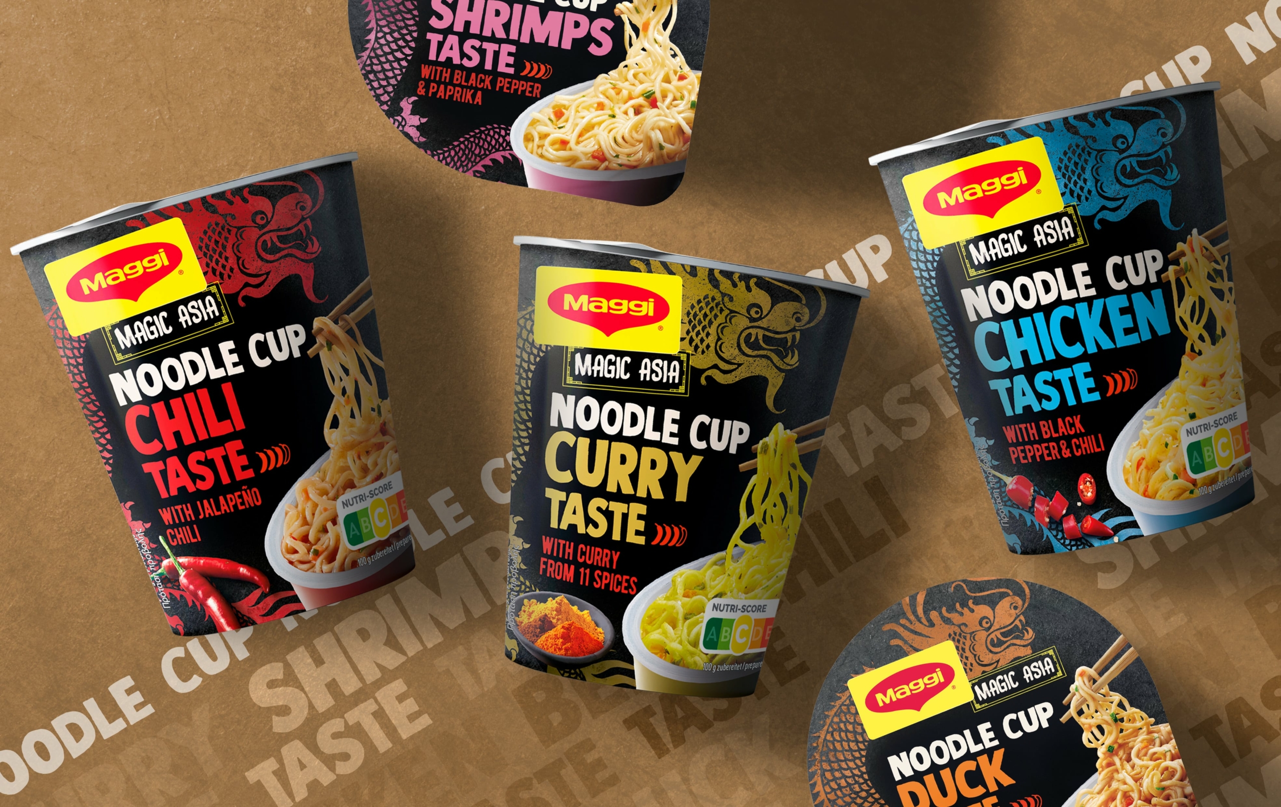
1. the background of the Maggi Magic Asia Noodle Cups is still dark, but no longer simply black, but designed as a medium to dark brown rattan weave, depending on the variety.
2 Of the three symbol routes that were initially on the table, we ultimately decided on the one with the dragon – for two reasons:
– The dragon is a key symbol for Maggi Magic Asia. It has already graced earlier packaging and thus corresponds to the brand’s desire not to forget its traditional characteristics despite all the focus on modernization.
– In addition, the dragon is a celebrated symbol of good luck in China, which gives the packaging an emotional touch.
Compared to the “old” one, our redesigned or newly illustrated dragon takes up a little more space on the noodle cup, so that it stands out better and also gives the overall design more structure. Incidentally, the color of the dragon varies from variety to variety, which contributes to effortless differentiation.
3) The typeface of the new packaging design is clearly similar to that on the previous packaging, but it has been chosen more clearly, especially for the variety name, so that it appears more distinctive.
4. thanks to the discreetly integrated, yet easily perceptible information on preparation and preparation time, as well as on the mandatory nutri-score and ingredients, the packaging informs the consumer in a straightforward manner about the most important facts about the product.
With all these details, the new packaging design of Maggi Magic Asia Noodle Cups meets all the requirements of the brand and the modern consumer.
By the way, in the course of redesigning the packaging, we had another challenge to overcome: there was no possibility to realize a fresh product shoot of the modified Maggi Magic Asia Noodle Cups after the implementation. That’s why we had to retouch and restage the images.


