
We were able to show the brand company Rügenfisch how to be successful with brand-strategic work to the point and how to optimally implement the results from logo to packaging in a design concept. In the process of Market Research + Consumer Collaboration Quantitative market research was an important component for the victorious battle of the brand + packaging design relaunch.
The company Rügenfisch calls brands like Hawesta, Lysell or Rügenfisch its own. For the reorientation and repositioning of the Rügenfisch brand, the company relied on our consumer-oriented expertise.
From the very beginning, the consumer has been at the centre of our work. Ultimately, it is the consumer who is the decisive factor as our client’s customer. Using independently conducted quantitative online studies, we researched what consumers expect from fish and canned fish. In addition to the aspect of authenticity, consumers had high expectations in terms of health and freshness. Attributes that were previously rather difficult to associate with canned fish.
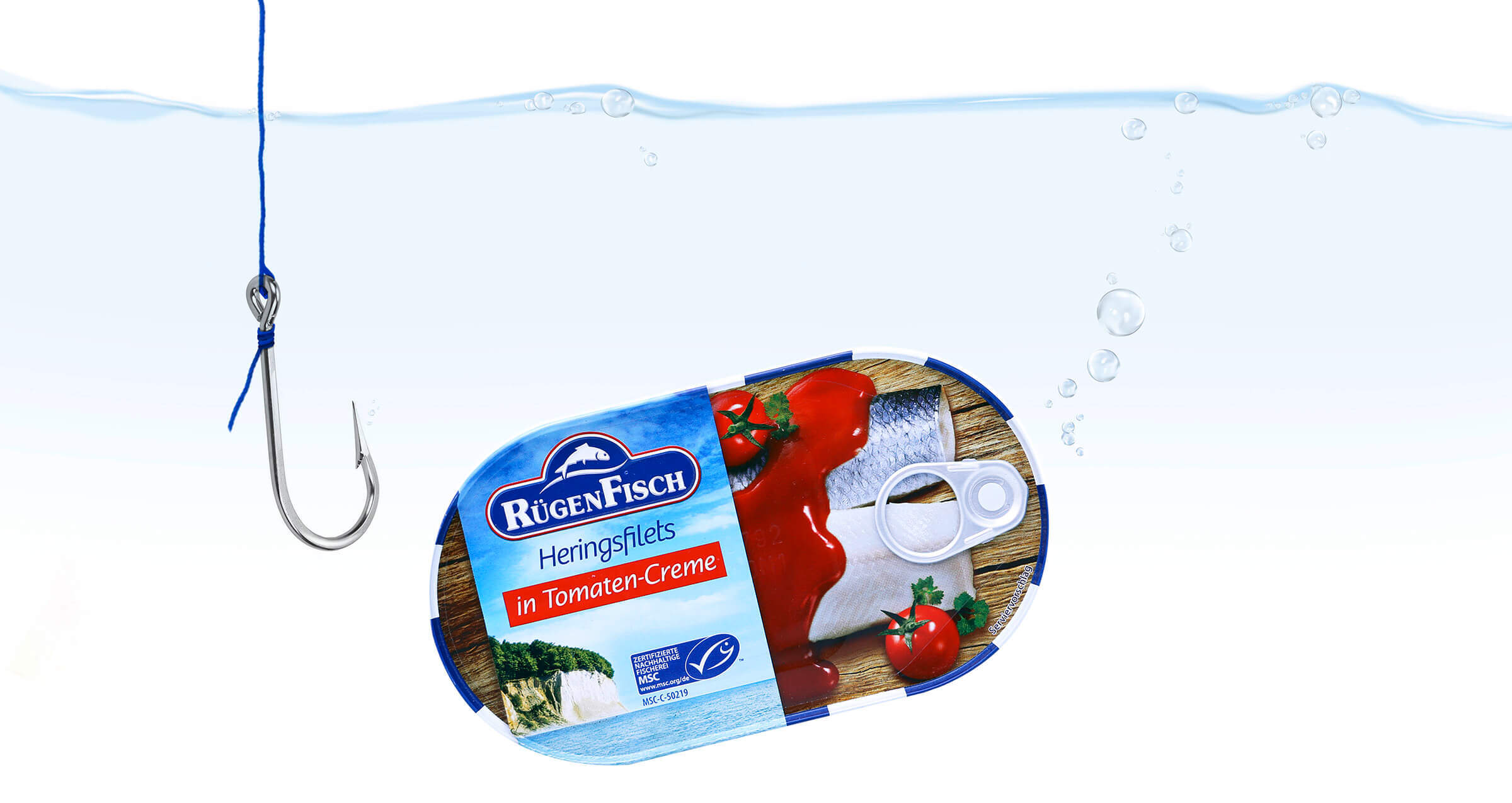
Our reorientation of the packaging appearance clearly focused on the values determined. The chalk cliff is a well-known and positively charged symbol for the popular island of Rügen. The image strikingly and authentically conveys the freshness and quality of air and water as well as the feeling of healthy living by the sea. Elements that are picked up by the refined, blue and white striped can rim. The maritime element acts as a frame that shapes and enhances the effect of the picture.
The product itself presents itself down-to-earth and rustic – entirely in the spirit of the “East German” brand Rügenfisch, which in contrast to its “West German” counterpart Hawesta stands for rather rustic and hearty fish specialties.
One detail that we have deliberately placed very prominently is the MSC logo. In the course of our consumer survey, it became apparent that consumers pay a great deal of attention to the MSC seal and strongly associate it with freshness, health and even authenticity.
In order to transfer the values preferred by consumers to the brand, we had pushed the Rügenfisch logo to new freshness, health and strength with an effective facelift. Where the fish previously rested rigidly on a beam, it now jumps faily out of a moving wave.


