
For many years, the Sebamed brand has stood for healthy skin care – both prophylactically for normal skin, which should not be exposed to unnecessary substances, and for skin affected by skin diseases or mature age.
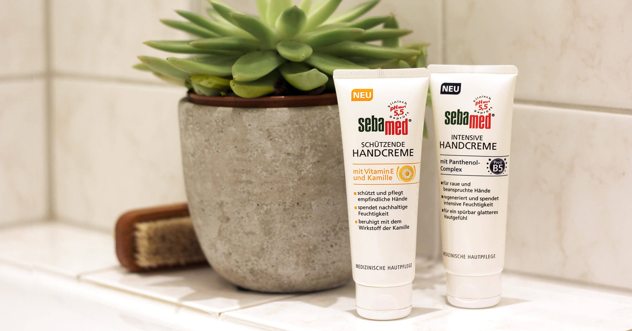
With the Brand + Packaging Design, the characteristic, strongly medical-looking white colour and the striking green-magenta colour combination of the Sebamed logo are set. There is hardly any creative freedom. We were all the more pleased to be able to develop a new, professional-cosmetic appearing series of pictograms and to integrate these initially with 2 hand cream products. In developing the pictogram, the primary ingredients (e.g. chamomile, Pro Vitamin B5) had to be clearly identified and a functional appearance created.


