
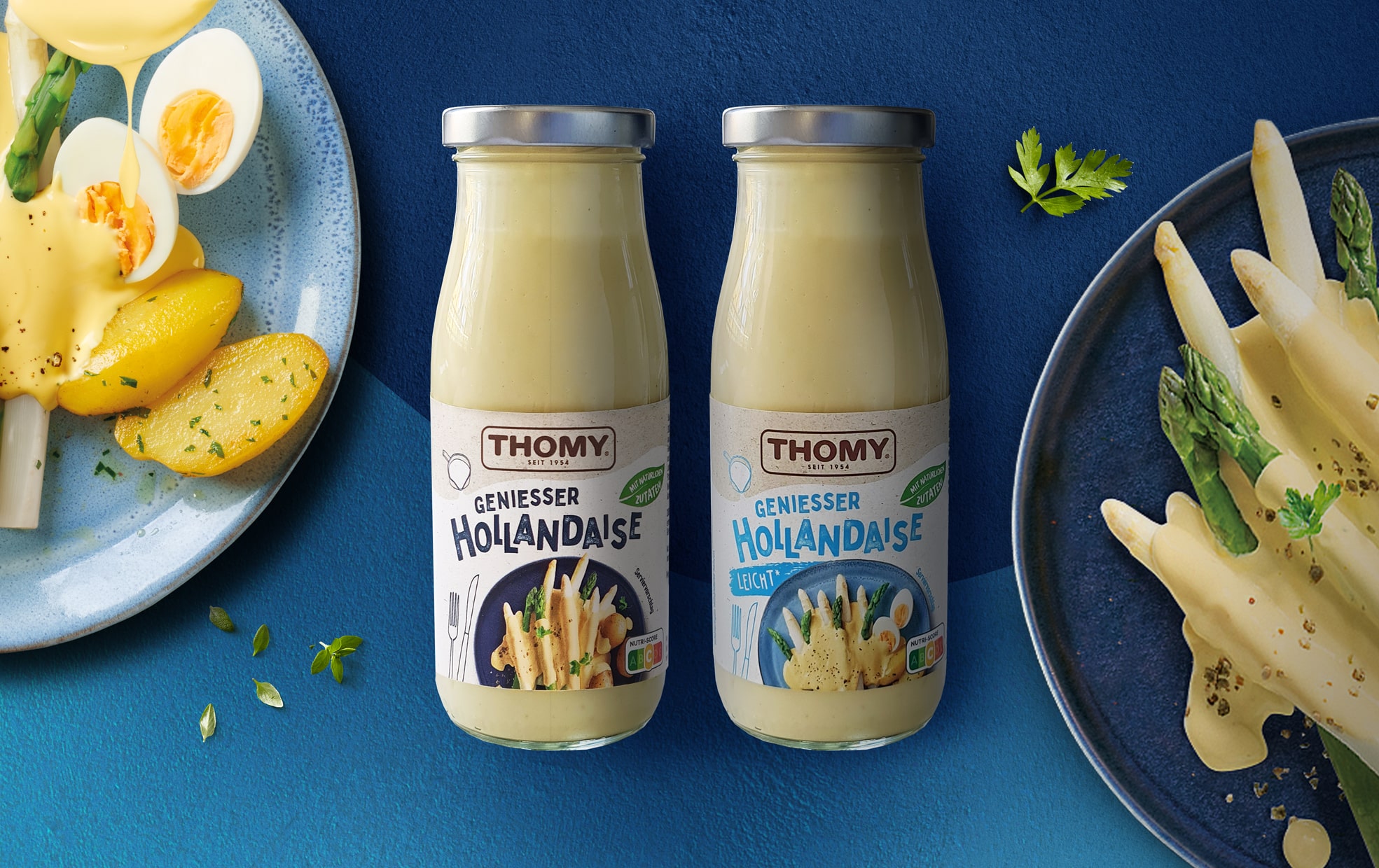
Even classic products such as a sauce hollandaise need a visual refresh to stand out and attract attention in the competitive environment of a store shelf. Thomy Sauce Hollandaise in a new glass bottle reveals the creamy texture of the sauce at a first glance, but that’s not enough. To give customers an additional visual incentive, we redesigned the labels for the sauce’s two different flavors and enriched them with delicious food shots. They give customers a serving suggestion for their favorite dishes and whet their appetite right away. Color coding and playful typography serve to differentiate the varieties without changing Thomy’s overall design, which remains informative, clean, yet new and fresh.
This project was one of many we were privileged to work on over the last year within Thomy’s extensive product portfolio. It’s always a challenge to work on an existing product range and give it a fresh look without disrupting the core of the brand and losing its recognition on the market shelf, but it’s a challenge we’ve since successfully overcome with many other brands already.
Look forward to our other new designs for Thomy and the new story that is developing with these products as well as further Realunches of the Sauce Hollandaise.


