
At THOMY, everything revolves around the joy of culinary pleasure. The Tetra Pak sauces refine a wide variety of meat, fish and vegetable dishes. They ensure a particularly aromatic taste experience. And this is precisely what the packaging design is intended to convey, to give consumers a feeling of what awaits them when they actually use the Tetra Pak sauces, just by looking at them. THOMY commissioned us to relaunch the packaging design. We didn’t fall out of all the clouds in the process – but the sauces and the enjoyment do in a symbolic way.
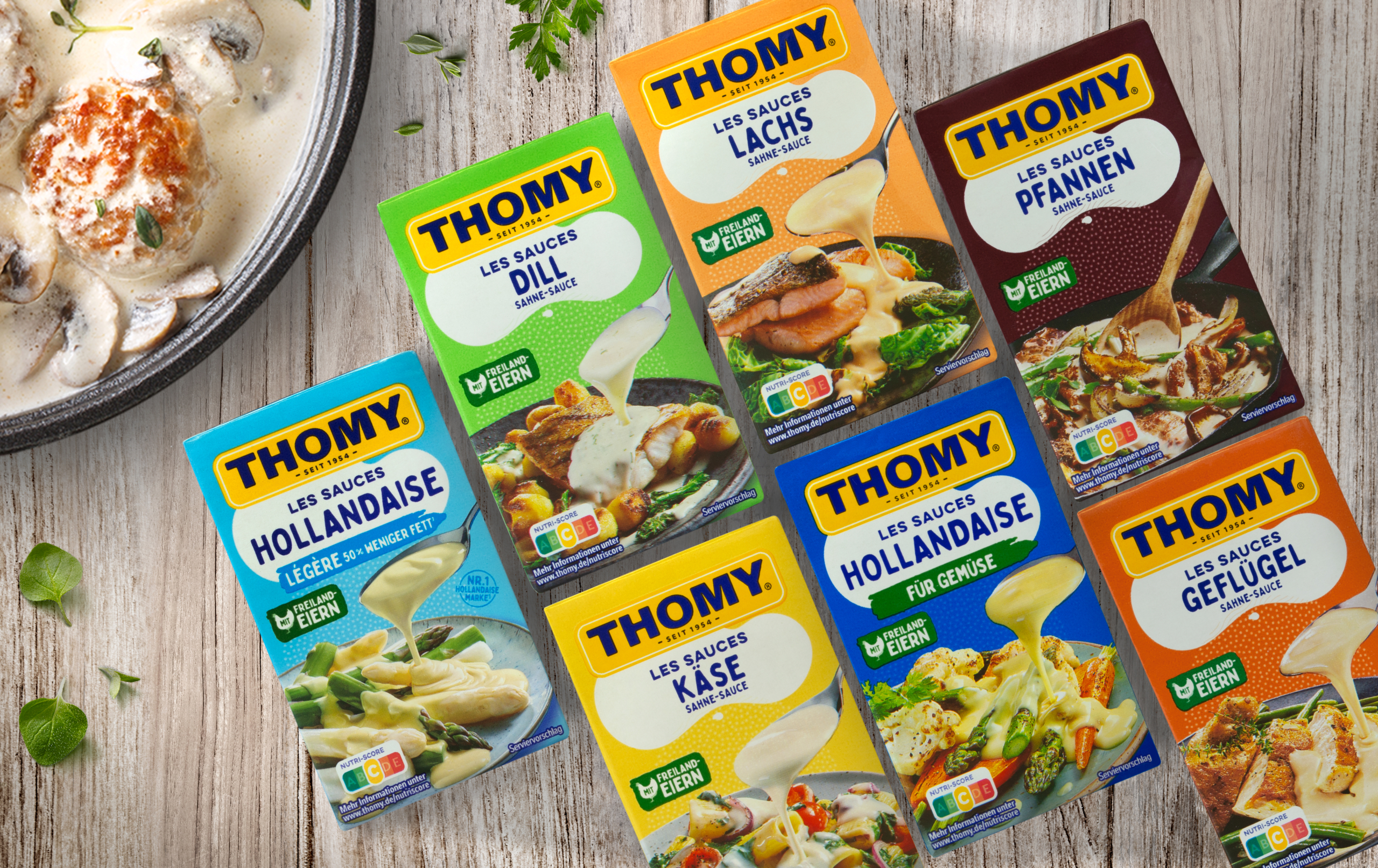
The THOMY brand has a cult following and is an integral part of the food market – a status that has been true at least since 1971, when the brand became part of the Nestlé Group. Accordingly, when redesigning the packaging, it was important to keep the brand logo prominently displayed. The many gourmets who appreciate THOMY associate wonderful things with this company logo: Experiences full of pleasure. Therefore, our designers’ primary task was to keep the brand’s “figurehead” in the focus of attention. The large-format placement at the top of the packaging achieves just that.
The white cloud has been a unique selling point on the packaging of THOMY Tetra Pak sauces for some time now, but it has never stood out as clearly as it does in the brand new design. The fact that it now stands out is largely due to the story that this cloud now tells: Indulgence is raining from it, so to speak, because it itself and the white dots that seem to fall from it symbolize, of course, the delicious sauce that consumers pour over their dishes to give them the proverbial icing on the cake. The cloud also contains the name of the respective variety – written in a specific, recognizable font that immediately triggers the desired “aha” effect in consumers (“Aja, one of those delicious THOMY Tetra Pak sauces”) and thus supports the branding.
The story of raining indulgence continues on the packaging: under the cloud and the dots, the realistic food shot finally makes your mouth water. The exemplary image of the dish that can be enhanced with the sauce takes up about half of the front of the packaging. Consumers react particularly emotionally to images – and emotions promote sales success. This is the basics of advertising psychology, which our designers naturally used to redesign the packaging of THOMY Tetra Pak sauces.

Another very significant aspect concerns the quick perception of the different varieties. Due to the previously mentioned “preference” of recipients for visuals, the optimally legible designations in the cloud are not sufficient. But there is a simple means to make it easier for consumers to quickly distinguish and assign the Tetra Pak sauces: Colors! The background color of each package is chosen to perfectly match the respective sauce. For example, the package of the classic Hollandaise sauce is presented in a medium blue, while the reduced-fat version comes in a lighter shade of blue. The dill sauce is light green, while the salmon sauce is salmon-colored, to name two more examples. What all the colors of the THOMY Tetra Pak sauces have in common: They are optimistic, cheerful, inviting.
Simple yet easily recognizable mandatory information, such as the ingredients and the Nutri-Score, complete the successful packaging design. And then there is the big picture – or rather, what is not directly visible, but is nevertheless reflected in every detail and thus also in the totality: The overriding themes of the Tetra Pak sauces and their packaging design are family and the thoroughly likeable world of THOMY products, which make our everyday lives more colorful and enjoyable. The brand’s products are aimed at young and old, at people of all generations who want to celebrate culinary delights together.
For a brand that has already been established on the market for decades, the relaunch of the corporate design and thus also of the packaging design always represents an enormous challenge. After all, despite the prevailing modern thinking and acting, it is also important to consciously preserve the traditional, since it functions as the DNA of the brand, so to speak. If you look at the original packaging design of THOMY Tetra Pak sauces from 1987 and compare it with the latest version, you will notice clear changes, but you will still recognize at first glance that it is one and the same brand. With this in mind, we can proudly say: Mission 100 percent accomplished.