
The well-known THOMY brand was developed to make the culinary life of consumers more enjoyable. The tubes of creamy mayonnaise, spicy mustard and aromatic remoulade are intended to enhance the taste of a wide variety of dishes, to give them that certain something. This added value should already emerge from the packaging design – and it should be quite a bit stronger and more modern than before. The brand entrusted our designers from B+P Creality with the challenging task of the idea implementation. The result is something to be seen and, yes, almost tasted.
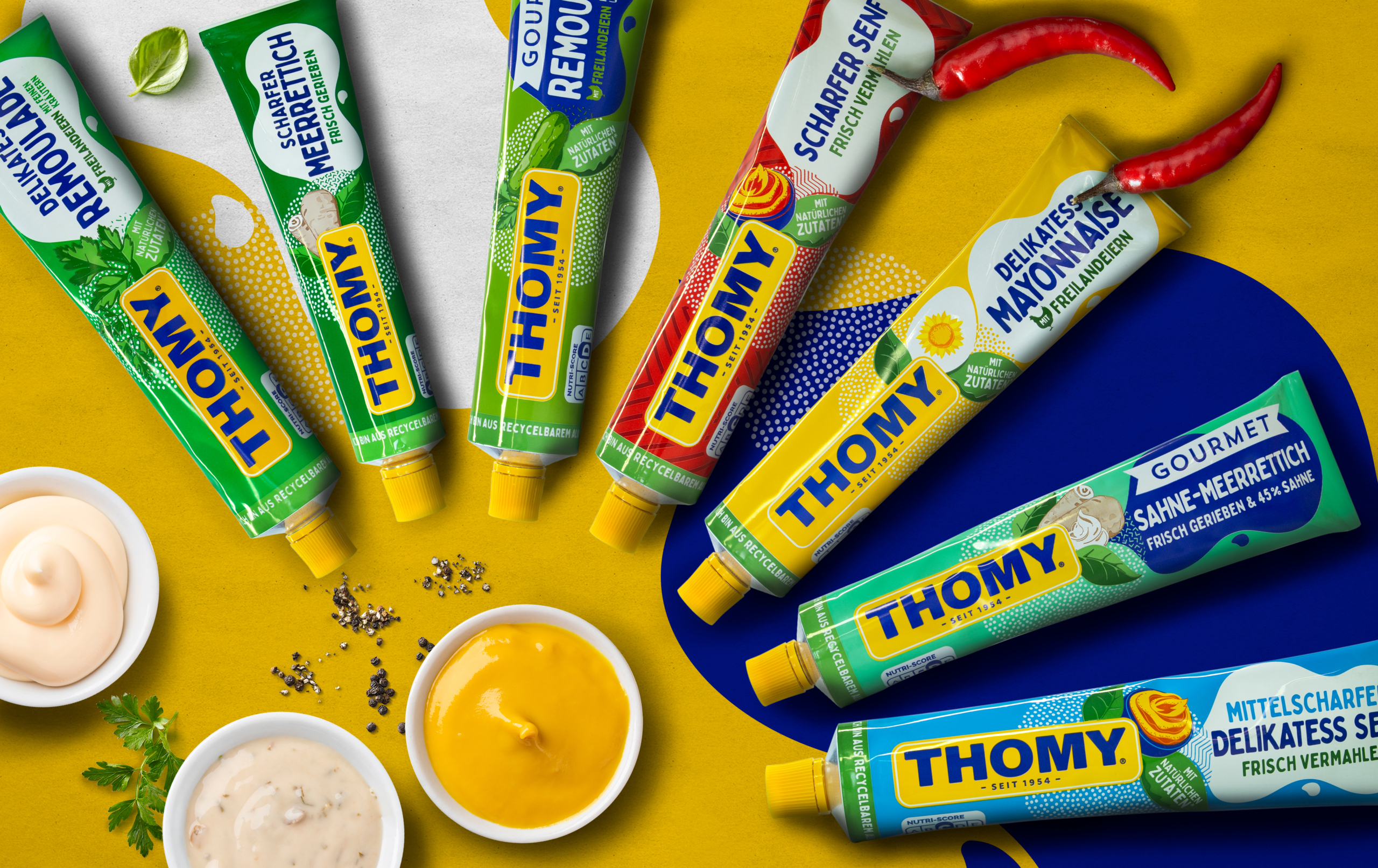
THOMY products have been on supermarket shelves for decades. Consumers associate the brand with uncomplicated enjoyment, which can be achieved simply by buying and using the food products, all of which are designed to delicately enhance dishes. In terms of packaging design, this primarily means that it is imperative that the brand is recognizable. With this in mind, when redesigning the remoulade, mayonnaise and mustard tubes, it was very important to keep the brand logo in the perceptual focus. Customers should grasp at first glance with whom they are having the pleasure. The large-format placement of the THOMY company logo, which extends over roughly half the tube, takes this into account.
Cloud instead of chef’s hat: For a long time, the latter was a unique selling point of THOMY. On the former tubes and also on some other packaging, it formed the background of the brand logo, but especially on the Tetra Paks and jars, the chef’s hat hardly appeared as such – rather, it resembled a cloud. To resolve this ambiguity, the new packaging design simply but expressively features “only” a clearly identifiable cloud. In most tubes it is white, but only in the Gourmet range is it a deep dark blue, in order to stand out and make it easier for the customer to distinguish the products from one another.
Speaking of colors and differentiating: Each tube has a different base color, each matching the contents. For example, the background of the spicy mustard is a fiery red, while the tubes with herbaceous ingredients appear in various shades of green. However, all the colors used have one thing in common: they radiate pure optimism and unadulterated cheerfulness. Incidentally, this also applies to the selected fonts, which appear clear but by no means stiff, but rather loose and relaxed – in other words, they embody exactly what mainly characterizes THOMY. A practical side effect is that the font in the cloud has a great recognition value, which supports the branding.

The tubes tell a story of pleasure, do you see it? In the cloud is written in each case, which variety it is, such as “Delikatess mayonnaise with free-range eggs” or “Sharp horseradish freshly grated”. And out of the cloud it rains many small dots. The latter, in turn, are enthroned with an appealing, modern illustration of the characterizing ingredient (for example, horseradish, egg, or herbs) or the product itself (a keg of mustard). With a little imagination, it quickly becomes clear that the cloud and dots symbolize the specific food product and creatively represent how the consumer spreads the mayonnaise, mustard or remoulade from the tube over their dishes or “drops” it onto the plate.
In short, the packaging design is clearly divided into two sections: On the side of the typically yellow tube cap, the distinctive brand logo immediately eliminates any potential misunderstanding regarding the product manufacturer. Next to it, the cloud clarifies the type of remoulade, mustard or mayonnaise. And the dots act as a link between the two segments, so to speak, resulting in a connected, dynamic whole that also fosters the storytelling effect described above. Mandatory information such as the Nutri-Score is elegantly integrated – easily recognizable without disrupting the overarching design idea.
In addition to the story of immediate enjoyment, this overriding design idea also includes another aspect that in principle reflects the brand philosophy: With the tubes and all other products in the range, THOMY aims to enable families to enjoy culinary feasts time and time again, without consumers having to go to great lengths themselves. It’s all about emphatically light enjoyment, which the brand wants every generation to experience. THOMY has created a colorful world that is fun. And our artists have succeeded in bringing this weightless world to the mayonnaise, remoulade, and mustard tubes in a contemporary design – of course, taking into account the traditional characteristics of the cult brand founded in 1954.


