
Visual trends in packaging design: brand-first and character typography

Have you seen Bahlsen’s new packaging design while shopping? It is a successful example of the visual trends that we would like to introduce to you in more detail below: Brand-first and character typography.
What do the visual trends brand-first and character typography mean?
The brand-first trend in the context of packaging design is about the brand name becoming the core visual element of the packaging. Where there were food shots before, for example, the brand name now simply stands out. Striking is a good keyword, because it leads on to character typography, which is the second aspect of the trend. It describes the striking, expressive design of the typeface, for example through the size, the font and/or the color(s). The combined visual trend brand-first with character typography means the creative emphasis of the brand name on the packaging.
Who is the brand-first trend suitable for?
For established brands in particular, the brand-first trend is an excellent way to consciously differentiate and signal: “We are the brand that has made a name for itself through high quality and established itself in the market.” This is because there are more and more imitators producing similar products. So to stand out from the ever-increasing competition, the brand-first approach with compelling character typography can be a useful solution.
But this trendy design strategy is also an opportunity for young, up-and-coming or even completely new brands to make a direct statement, to appear self-confident – on packaging as well as in other branding.
What is important in character typography?
Of course, character typography must represent the particular brand with its corporate identity and philosophy, and also harmonize with the specific product in order to be authentic and achieve the desired effect. Simple example: If a brand stands for high quality, seriousness and elegance, an overly colorful and at all particularly playful character typography would be anything but ideal.
How different fonts work
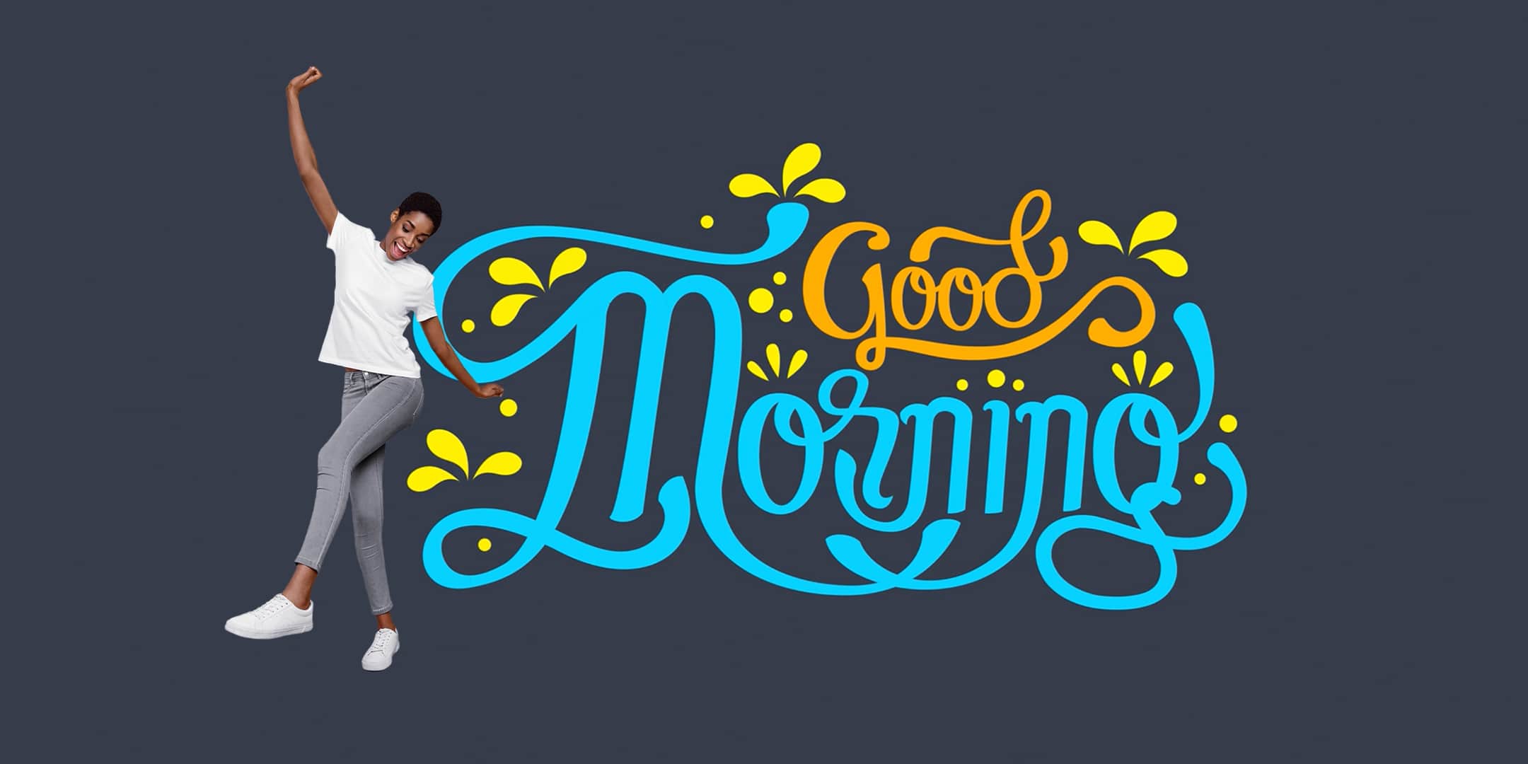
Not only, but especially on product packaging, typeface is an essential part of storytelling. The packaging should tell the consumer a story, appeal to him emotionally. Fortunately for brands and packaging designers, this can also be achieved with typefaces, among other things. Because believe it or not, different fonts evoke different associations and feelings in people.
Each typeface has its own character. This is already inherent in the basic shape of the letters. Typographers refer to this as the architecture of the typeface. Thanks to psychological analyses, we even know more about the effect of certain font features on our perception:
– We generally perceive typographies that are designed in the style of handwriting and have open, rounded forms as warm and friendly.
– Geometric, closed typefaces have a more technical and cool effect on us. But for certain products, this is not necessarily negative. The packaging of a computer, for example, really doesn’t need to radiate warmth, but should rather convey functional strength. This is better achieved with clear, unadorned typography.
– While we associate wide letters with stability, we tend to associate narrow typefaces with instability. Accordingly, we tend to perceive right angles as hard, while rounded angles are soft and gentle.
– Typefaces with short ascenders and descenders often appear down-to-earth, while those with pronounced lengths appear elegant.
– If the emphasis is horizontal, the typeface appears more dynamic. If it is more vertically oriented, the typography gives a solid, static impression.
Note: As indicated with the geometric fonts, there is no universal good and bad with regard to the various typographic characteristics, i.e. in the sense of “typographies with characteristics X are always well received and those with characteristics Y are always poorly received”. The decisive factor is that the typeface used achieves the effect it is intended to achieve in the specific case.
To illustrate the importance of typography on packaging, we also want to briefly point out the information level. The typeface tells the consumer the most important details about the product:
– who it comes from (the brand-first approach focuses on this information)
– what it is and contains
– what benefits and special properties it has
– how to use it correctly
By the way: character typography also works without brand-first
Of course, character typography is an interesting design detail on packaging even if you leave out the brand-first aspect. Perhaps instead of your brand name, you’d rather put the product name or some other piece of information in the foreground and thus present it in character typography. Logically, this does not change the effects of the various properties of typefaces.

Conclusion
Character typography is a trendy visual stylistic device that you can use to specifically influence or emotionally color the story that your packaging is supposed to tell. If you want to make your brand the protagonist, it makes sense to use character typography to represent the brand name in line with the brand-first trend. We would be happy to support you in developing a character typography that perfectly matches your brand and your product.