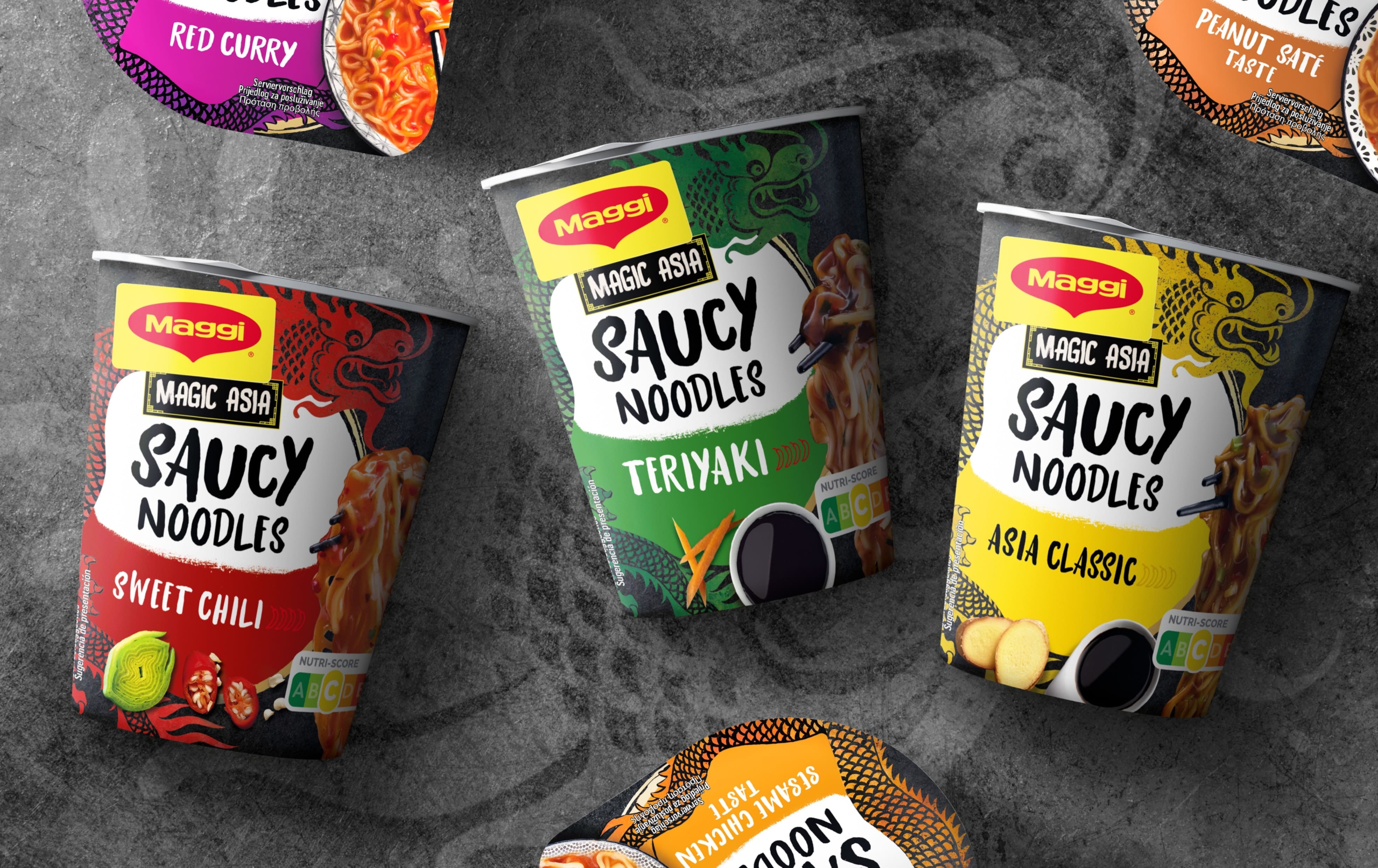
Magic Asia is one of the most popular sub-brands of the cult brand Maggi. The product line has been enriching the selection in supermarkets since 1992. Over the years, it has grown and not long ago, Saucy Noodles were added, once again promising great culinary delights. Last year, Maggi asked us to make the packaging design of the delicious noodles with sauce clearer, more modern and more seductive.
As is characteristic of all Maggi products, the still relatively new Magic Asia Saucy Noodles in the practical cup also enable spicy taste experiences with particularly little cooking effort. They are available in a number of delicious varieties. A few hand movements and minutes are all it takes to prepare the saucy noodles with many typical ingredients from Asian cuisine, ready to be enjoyed.
In order to further increase these moments, i.e. to ensure that consumers are even more convinced than before when they are out and about in the supermarket and pass the shelf with Maggi Magic Asia Saucy Noodles on their shopping tour, the packaging design had to be optimized to some extent.
The packaging was to attract positive attention with modern details and make it clear that it is not a soup, but noodles with sauce. At the same time, the redesign was about retaining core features so that existing friends of the product could easily recognize “their” Saucy Noodles.


Our task was therefore primarily to modernize the look without changing the content of the sub-brand, i.e. Magic Asia. It was also important to highlight the nature of the product in the simplest possible way to avoid confusion. Here is an overview of the most important features of the packaging design for Maggi Magic Asia Saucy Noodles:
– dominant dark background in line with previous designs supports the recognizability of the product
– The font chosen is exactly the same as that used for the previous packaging (striking, creative, sweeping, but at the same time clear and easy to read) and also serves as a good recognition feature.
– attractively designed dragon acts as an emotionalizing element (traditional key symbol for Maggi Magic Asia and symbol of good luck in China)
– Noodles in focus – the sauce in the bowl is shown smaller, but still comes into its own – contribute to the clear differentiation from the soups (the latter will soon be presented in their new look)
– inviting images of essential ingredients and other Asian symbols (chopsticks, patterns) round off the overall look in an authentic and attractive way
– Variety names highlighted in different colors ensure simple differentiation of flavors
– unobtrusive but effortlessly perceptible integration of important information (nutri-score, ingredients, preparation) satisfies the consumer’s hunger for knowledge
All these features ensure that the new packaging design of Maggi Magic Asia Saucy Noodles meets both the brand’s requirements and the high demands of the modern consumer.
Incidentally, we faced an additional challenge in redesigning all Maggi Magic Asia packaging: Since no separate product shoot of the changed packagings materialized, we had to retouch and restage the original images.