
Hollandaise sauce, which THOMY first launched on the market in 1987, is now one of the brand’s most popular products. Over the years, it has become a true THOMY classic and a must-have, especially with asparagus dishes, if you want it to be quick but still taste fresh and good. In order to highlight the brand and its increasingly important brand purpose, THOMY decided to redesign the popular Sauce Hollandaise bottle and commissioned us to create and realize the desired packaging design.
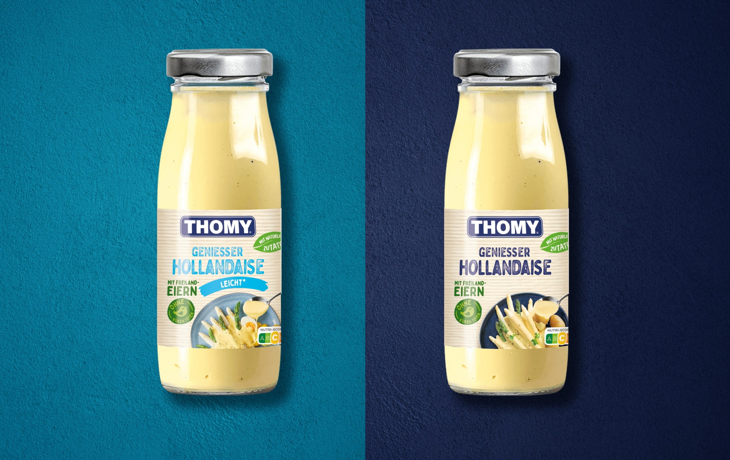
On the new label, the logo stands above everything – in the truest sense of the word. THOMY wanted to give its name more presence on the Sauce Hollandaise bottle. With the framed lettering in striking purist white on an elegant dark blue background, this has been achieved excellently. Compared to the previous design, the logo now stands out more clearly and immediately catches the eye.
Speaking of clearer: In general, the new design of the THOMY Sauce Hollandaise bottle is characterized by a striking clarity. It appears structured and thus also very clear – something consumers are known to attach great importance to. At a glance, the viewer can grasp the main points. In addition to the brand, these are the type of product and its special features (in this case, natural ingredients, free-range eggs without chick-killing, and the now mandatory Nutri-Score information).
Apart from the logo, the foodshot was also to be revised somewhat. Specifically, our design team had the task of clearly(er) highlighting the role of the product in the preparation of a dish. The chosen solution is as simple as it is meaningful: with the delicious, creamy sauce flowing from the spoon onto the tastefully presented asparagus, the packaging design removes any doubt about the added value of the food. At the same time, the food shot provides an appealing inspiration for which dish the Hollandaise sauce is particularly suitable.

The striped background in subtle colors rounds off the overall picture stylishly. It radiates the familiar lightness and joy typical of the THOMY world – in the sense of “Let’s quickly cook something nice for ourselves and have an enjoyable time together”. Incidentally, the color tones of the stripes pick up the background colors of the last design again, so that despite the literally clear changes, a wonderfully harmonious transition from old to new has resulted. This is an essential point, after all, the product should remain clearly recognizable.
In general, the colors are largely the same as before – only the logo has been given a fresh coat of paint. The bottle itself is also the same as its predecessor: it is still transparent to give consumers direct visual access to the Hollandaise sauce, and also still features its silver-colored lid.
All in all, it can be said that the new design of the THOMY Sauce Hollandaise bottle is less ornate and playful than before. It presents itself clearly structured, but without losing the relaxed, familiar charm that has characterized THOMY as a brand for many years. Maintaining this basic mood and also placing the central points – i.e. the logo and the role of the sauce in cooking – in the perceptual focus were the superficial requirements that the new packaging design absolutely fulfills.


