
For a long time, Nestlé Wagner had been offering an extensive range of pizzas with the subbrand “Big Pizza”, with a typically thick and at the same time crispy dough. The strategic target group here was young people who were primarily interested in fun, action and experience when enjoying pizza – alone or with a gang. The original premium impression of the packaging design with its dark colour scheme and its “American” reference to 1995, the year it was created, was judged to be no longer appropriate and purposeful in this context.
With the newly introduced packaging relaunch, the primary goal was therefore to sharpen the product positioning – away from the American style to the delicious pizza – as good as the delivery service. This was achieved primarily by expanding the pizza range – away from “just Big + American” to “Metropolis” and “Global” – and by correspondingly expanding the brand name: “Big City Pizza”. The newly defined varieties refer directly to this and are now all linked to well-known international big city names. The young people, who are primarily interested in the fun and experience of pizza enjoyment, will be retained as a strategic target group and will be inspired by a refreshingly different, bold design.

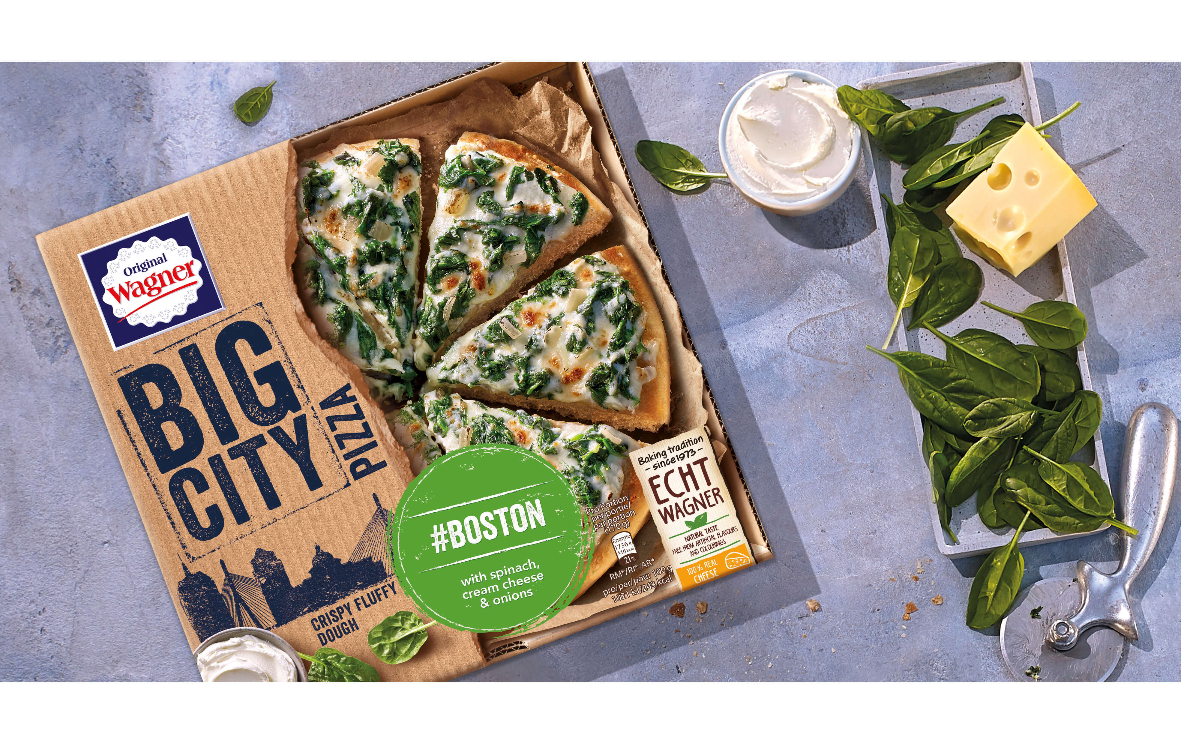
The packaging design follows the jointly developed design strategies and is now much more approachable and innovative and takes up the expectations of the young target group for internationally oriented and diverse pizza varieties, which would often rather order from the delivery service than resort to frozen pizza. Accordingly, the pack front represents a largely natural pizza service corrugated cardboard box, which is torn open and reveals a view of the appetisingly arranged Big City Pizza. A courageous and groundbreaking step that clearly conveys Wagner’s claim to innovative and at the same time down-to-earth pizza specialities.


